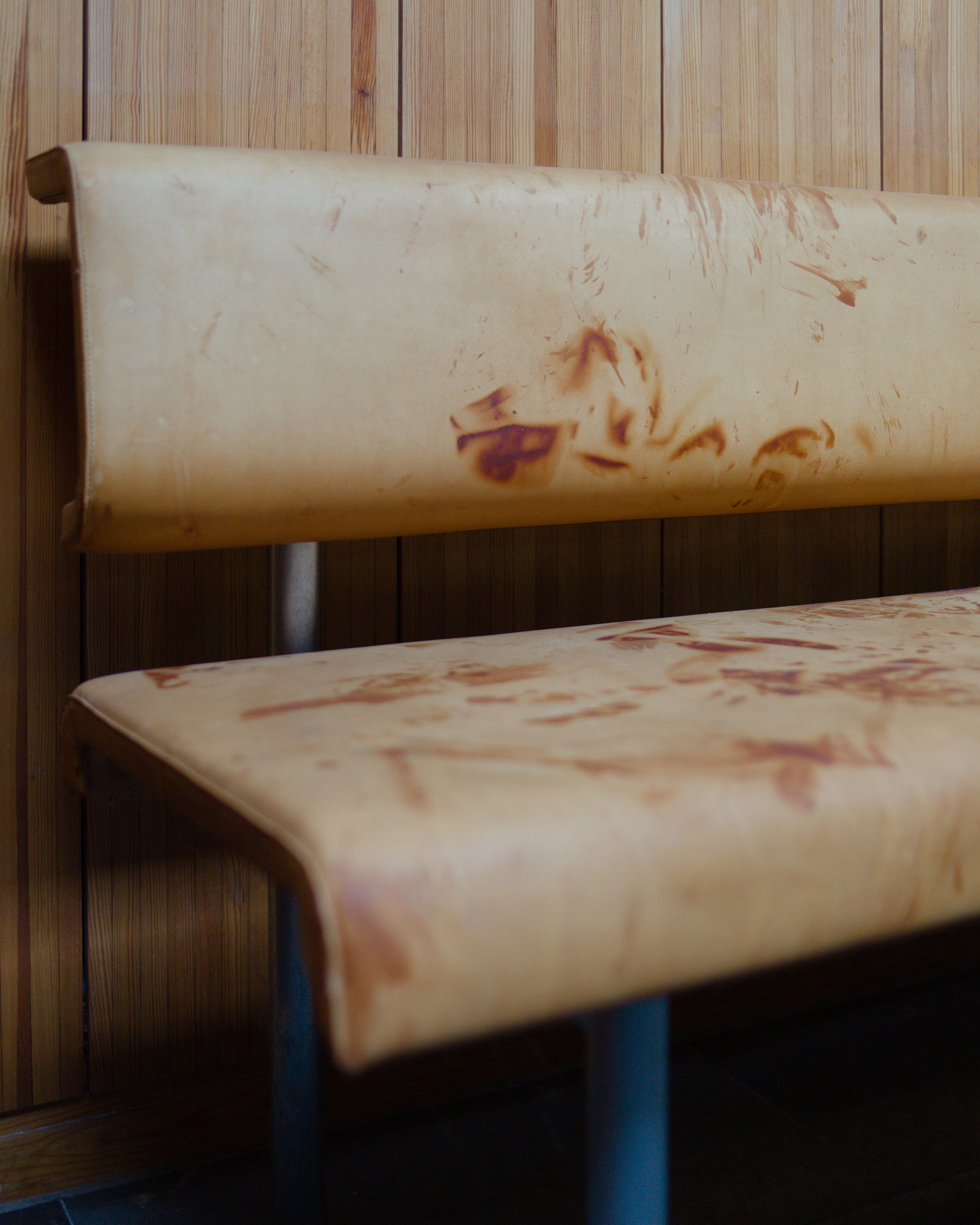
Storkällan Interiors
I had a chance to visit the interiors of the Storkällan chapels today. The building from 1970 was designed by Wolfgang Huebner and is brutalist in a way that is quite rare in Sweden. Lewerentz work, which the building likely references, is to my mind completely different. Huebners building connects with industrial and technological themes whereas Lewerentz, in my reading, works with completely different and older source material.
The exterior of the chapels is a bit too industrial and over articulated in my view. The corten steel canopies are just a bit too large. It has some very nice moments like the way the glass reflects the forests and the corten towers, powerplant-like as they may be, are beautiful in shape, material and scale.
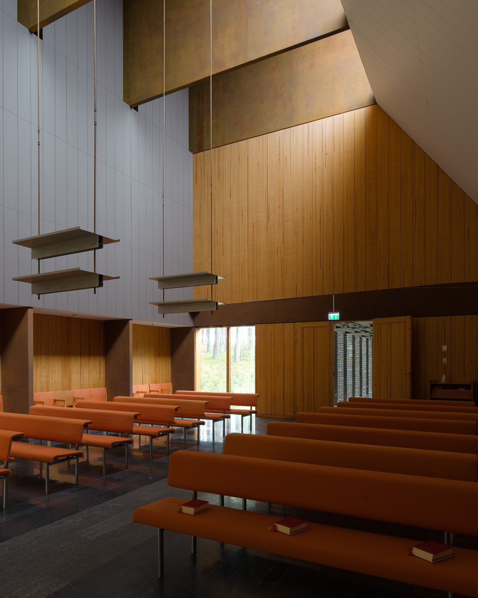
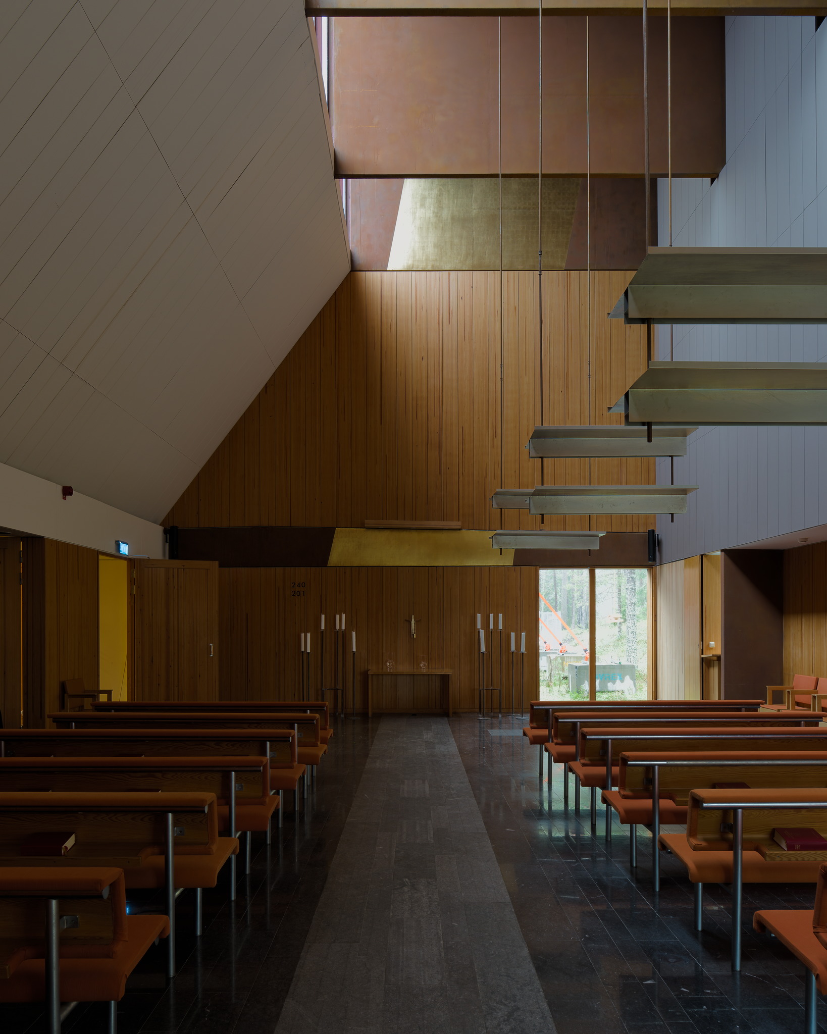
The interiors are really good. There's a lightness of touch lacking in the exteriors. Gold leaf is graphically applied directly to exposed corten. The flatness of detail works well with the way the rooms are shaped. The fold of the canopies are perhaps reccuring in other details one or two times to many, like when a degree students thinks architecture is about figuring out how to make the same figure appear in a project as many times as possible.
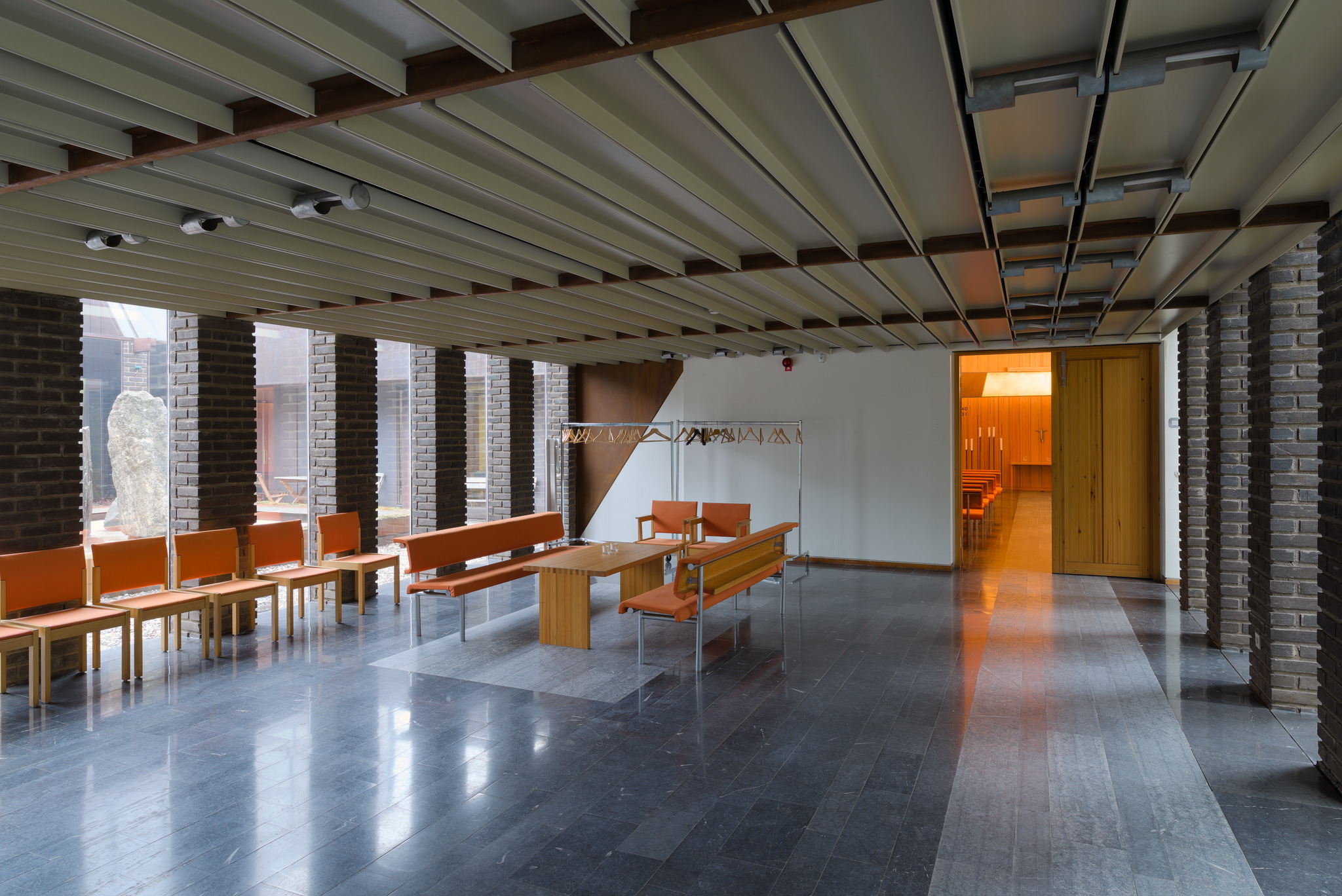
The furniture used to be leather, which dried out and has largely been replaced with an orange fabric. This is unfortunate and I think a better colour could have been picked. The windows in the chapels that stand on the floor were not part of the original design according to staff at the chapel.
